News
30 Oct 2018
The Psychology of Colour – Lighting the Stage
Subscribe to CX E-News
HOW TO
The Psychology of Colour – Lighting the Stage
by John O’Brien.
Stage lighting is a mixture of science and art. The science bit (electrical, mechanical) is highly objective.
It’s all Ohms Law and Newton after all. The art side is much more subjective and less explored in tech circles. Light and shade, movement and rhythm, and then … colour. These can be alien concepts for a naive design mind. But they add feel, soul, or atmosphere and can elevate certain moods while suppressing others.
Early on, I watched what other LDs did and looked to the world around me for inspiration. I began to notice the emotional effect that different colour combinations had on me so read up on some art theory. Then I tried putting these ideas into practice on the stage.
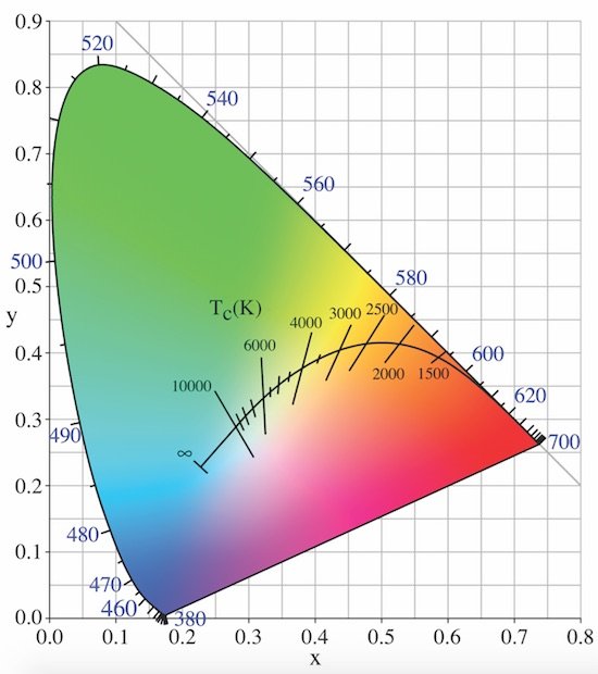
Plankian Locus
What is Colour Psychology? And just how does it relate to the stage?
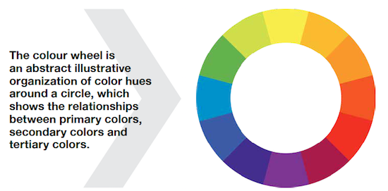
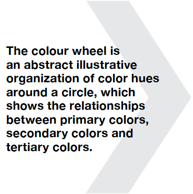
In art theory – red, green and blue are primary. Cyan, magenta and yellow are their opposites
(secondary or complements). ROYGBIV, colour wheels, trichromatic retinal receptors, colour constancy and a host of other arcane theories and tools like Planckian Locus can mess with your head. We’ll stick to some simple psych theories for this piece.
Colour psychology can be defined as “the study of hues as a determinant of human behaviour”. Plainly, colour:
– Carries meaning. (red = STOP, green = GO)
– Can be learned or be innate. (bright colours attract toddlers, nuanced colours an adult.)
– I s automatically perceived and evaluated by the viewer. (emotional not logical response)
– Can elicit colour-motivated behaviour. (red = ANGER, aqua = CALM)
– Changes meaning and effect within differing contexts (colour combinations, surrounding environment, cultural context).
So what has that got to do with lighting the stage? Absolutely everything. The gig of an LD is to enhance the performance in the given physical space (stage). Light and shade, angles and luminance are your basic building blocks. Colour(and movement) add emotion to compliment the performers.
Primary and secondary colours
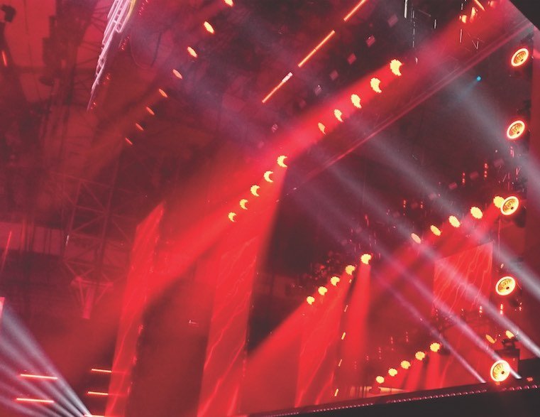
Red and yellow are warm by nature, signifying emotions from anger (red) to joy (yellow). Red is hot but can be gloomy in the right context. Yellow is bright and happy but the wrong shade can look sickly. White is bright (der…) and lively; it has an‘up’ vibe to it. However, it can also be very harsh – the effect of this is punchy (blinders anyone?) and contrasts well with solid colour blocks.
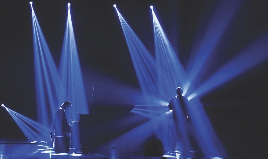
Green and blue are cool and placid. These shades have calming connotations on the psych side. Blue, although masculine, can be associated with tranquility and calmness. Greens can be soft or bold but may make some performers appear ghoulish on stage. Check with your artiste.
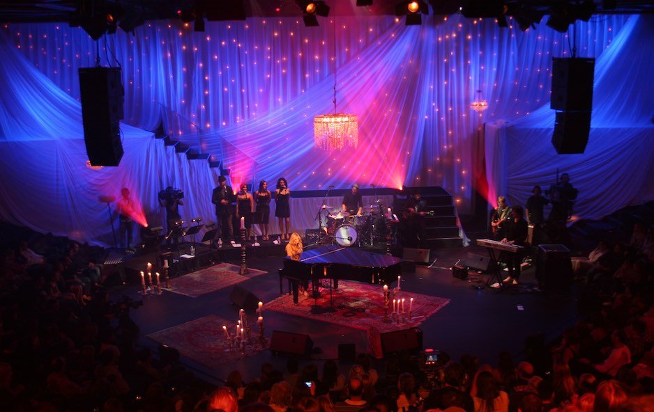
Pink – hot, rich, luscious, feminine. Purple – regal, sophisticated, powerful but also soft and tender when bleached out to lavender. Orange – the fire of red with the happiness of yellow. Hot but cheerful, even prestigious (think gold’s connotations of riches). Paradoxically, I find the saffron of Buddhist robes quite calming (culture effect).
Different skin types also reflect light in different ways. Lighter skin tones are highly reflective (and hence show the full gamut of the applied colour) whereas darker tones can be less so. Lustre also affects the reflected light quality. Sweat reflects and refracts, while light skin TV makeup renders less reflective to the camera (or eye). Use these differences to your advantage.
-

- Blue can produce feelings of calm
-

- Pink – hot, rich, luscious, feminine. Purple – regal, sophisticated, powerful but also soft and tender when bleached out to lavender
-

- Red can produce feelings of anger
-
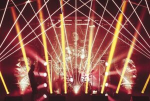
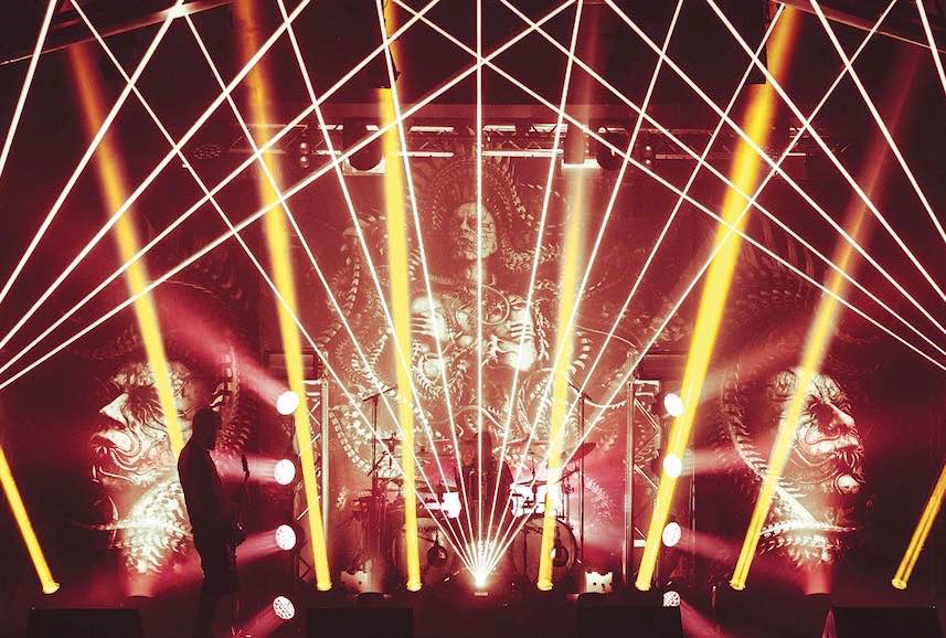
- Yellow can produce feelings of joy (Meshuggah, 2017. Photo: Kinglevel, Edvard Hansson)
Combinations and their effects
Here’s where it gets fun – putting the palette together. When mixing two or more shades, you can choose contrasting or complimenting hues. Contrast adds dynamism and excitement. Analogous hues suggest subtlety. Importantly, mixing the colours alters their emotional meaning.
Monochromatic mixes give sophisticated looks. Solid blocks of one or two colours have great impact, particularly when contrasted with solid black or white. Advertisers know this well. Take a look at the billboards and signage around you. They rely on punchy primary or secondary combinations with little subtlety. This is great in a rock context but perhaps too bold for a crooner.
Cartoon combos also have their place. Pink/green, yellow/blue, purple/aqua – it’s a heap of fun getting garish with acts that suit that aesthetic. Remember though, just because your fixtures have 16 million colours available doesn’t mean that you should use them all at once! Even a lairy psychedelic scene will benefit from careful selection of shades and avoid visual vomit. Sometimes less really is more.
All colours can be toned down in feel. Check out a bush sunset for subtle nuances. With analogue fixtures, use less intensity or a lighter gel. With RGB fixtures, change the hue. You can even (counter-intuitively) mix in some white. Hot pink with a little white is bold and strong. Less pink (or a subtler hue) and more white tends more stylish. Dim everything down (to bring out the black) and it all gets moody.
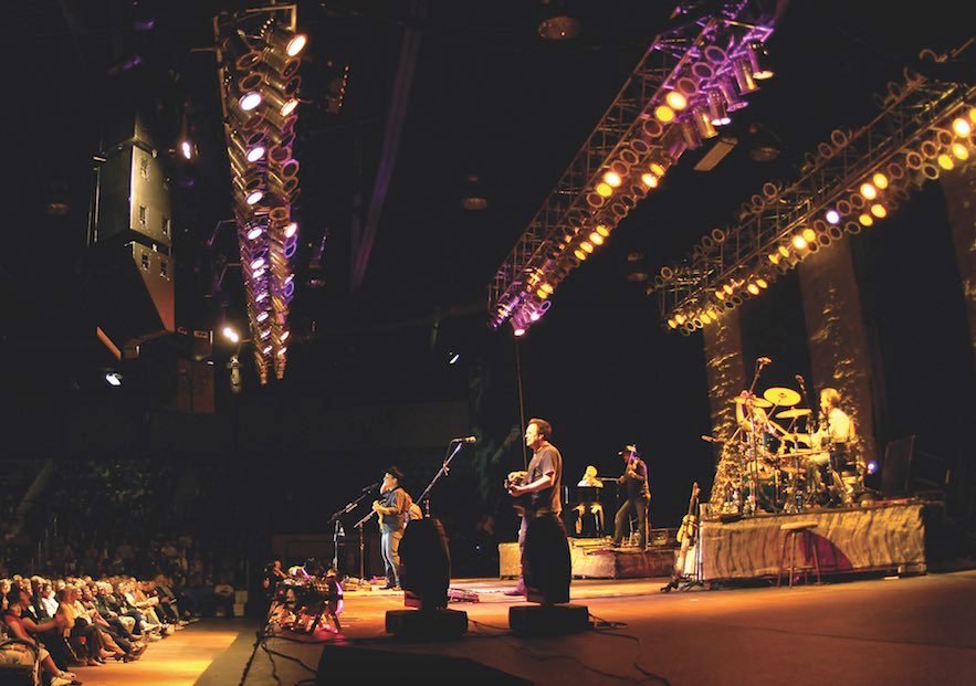
Use colour to punctuate the music keys (Photo: Airman st Class Benjamin Stratton)
Consider not only the juxtaposition of colours within scenes but between them. In concert, try calmer combinations during the verses and go bright and cheerful in the chorus. Also note the far more powerful emotive effect of major and minor keys in the music. Major keys are happy, bright and positive. Minor keys much more downbeat, if not sad. Select your colours and scenes carefully to match or enhance these moods.
Colour mixing and temperature
Without getting too technical over differences between additive and subtractive colour mixing, it is worth knowing the basics. Essentially, analogue fixtures (Par, Ray, Fresnel, etc and moving heads with CMY mixing) start with white light and then subtract all the colours except the gel hue. This is ‘subtractive mixing’.
Newer RGB LED lights add bits of red, green and blue together to achieve the desired hue, hence ‘additive mixing’. Add them all together to get white. You can use these differences to your advantage once you know that they are there.
It is also worth noting colour temperature and its effects on lighting choices. In a nutshell, different light sources produce different shades of ‘white’ light. On stage, this difference is subtle. Where it really makes a difference is in the camera. Film and video cameras see these disparities much more vividly than the eye. Video can be easily white balanced in camera, but film requires that LD and cinematographer work together.
-

- Subtle nuances in a bush sunset (Photo: John O’Brien)

-

- Subtle nuances in a bush sunset (Photo: John O’Brien)

What does it all mean to you?
Of course, all of this is highly subjective. One person sees things one way, the next person another. Culture can also play a big part in the perception of colour (pink for girls; blue for boys – in the 19th century, it was the other way around!).
Synaesthesia adds even more dimensions to the perceptive possibilities. None of the above takes into much account the wonderful array of features available with modern digital fixtures. Built-in strobing, gobos and beam movement add an action dynamic impossible to replicate with older analogue fixtures. However, the feelings that colours evoke remain the same.
Remember, there are no rules here – this is art after all. Get creative, try something new. Go solid colour, go cartoonish, go pastel mix or go no colour at all. Above all, do so with a deeper understanding of the effect that you are creating.
This article first appeared in the October 2018 edition of CX Magazine – in print and online. CX Magazine is Australia and New Zealand’s only publication dedicated to entertainment technology news and issues. Read all editions for free or search our archive www.cxnetwork.com.au
© CX Media
Subscribe
Published monthly since 1991, our famous AV industry magazine is free for download or pay for print. Subscribers also receive CX News, our free weekly email with the latest industry news and jobs.
Recent posts


Latest jobs